When Pantone speaks, agents and designers should listen. Since 2000, the firm has designated a color to represent the year ahead. Designers usually have the hue in their runway shows and retail giants mass produce the color in their wares. Knowing what the Color of the Year is and how it works in a home sets you apart from those in the field who just chase sales. Home is an art form, something human chase for a permanent feeling of security and beauty.
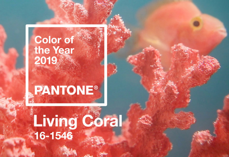
What is the hue?
Living Coral is a mix of pink, red and orange with gold undertones. It was selected for its life-affirming properties and to call attention to the plight of our dying seas.
How should it be used?
This is up to the homeowner or stager. When using small touches, make sure the shades match, or if varying shades to create visual layers, ensure that there is a wealth of textures. If investing in a statement Living Coral sofa or another large piece, the scale must fit the room. This color can become overwhelming if care is not given to the overall visual theme of a space. Try to avoid using Living Coral in an accent wall as it comes across as noncommittal rather than artistic.
What else goes with it?
Living Coral has predominantly been seen before its coronation by Pantone as a staple in coastal or tropical themes. As such, straw accents work well. Brass is the safest bet for metallic pairings. Jungle Green is a great contrasting hue, as is a crisp white. Choose straw or jute rugs, colored glass, or beaded or faux fur accent pillows.
How will you be using Living Color to stage homes this year?